How to choose the color of your kitchen countertop
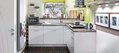
The color of kitchen furniture plays an important role in drawing up a sketch plan. Subsequently, the correctly selected shade of the countertop for the kitchen set will harmoniously fit into the interior and create its own special atmosphere.
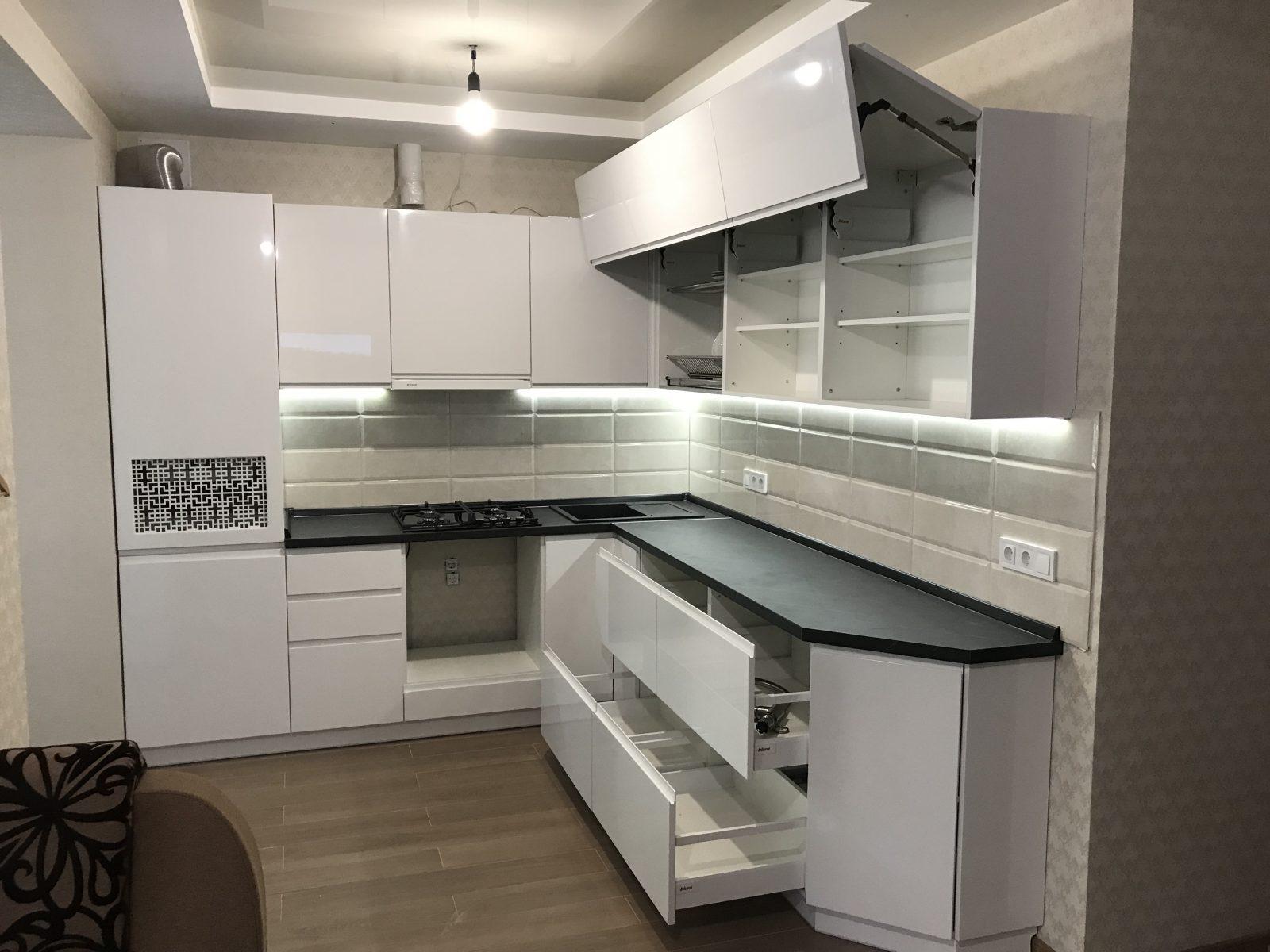
All tones, textures and patterns should be correctly combined with each other so as not to cause discomfort. Therefore, it is very important to know how to choose a kitchen countertop by color.
How to choose the right kitchen set
The choice of a kitchen unit is a responsible matter, since usually this design does not often change and serves for many years. When choosing, it is necessary to take into account several factors at once, and not only focus on the color scheme. Since the kitchen set is used almost every day, it must be durable and reliable. For this, high-quality materials are selected from which it is made.
The most common ones are solid wood, chipboard (chipboard), finely dispersed fraction (MDF) and multiplex. In this case, there is no need to focus on the price, since sometimes solid wood is inferior to chipboards in many respects. It is better to take the body or frame from chipboard, and facades from painted MDF, plastic or acrylic.
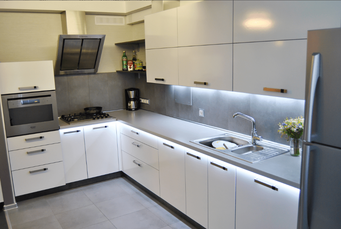
In addition to strength, it is important to look at the quality of every detail. They shouldn't have the slightest flaw. Each dent or scratch will increase over time, and spoil not only the appearance, but also worsen the functionality of the furniture.
How to choose the color of the countertop
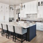
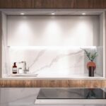
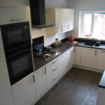
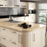
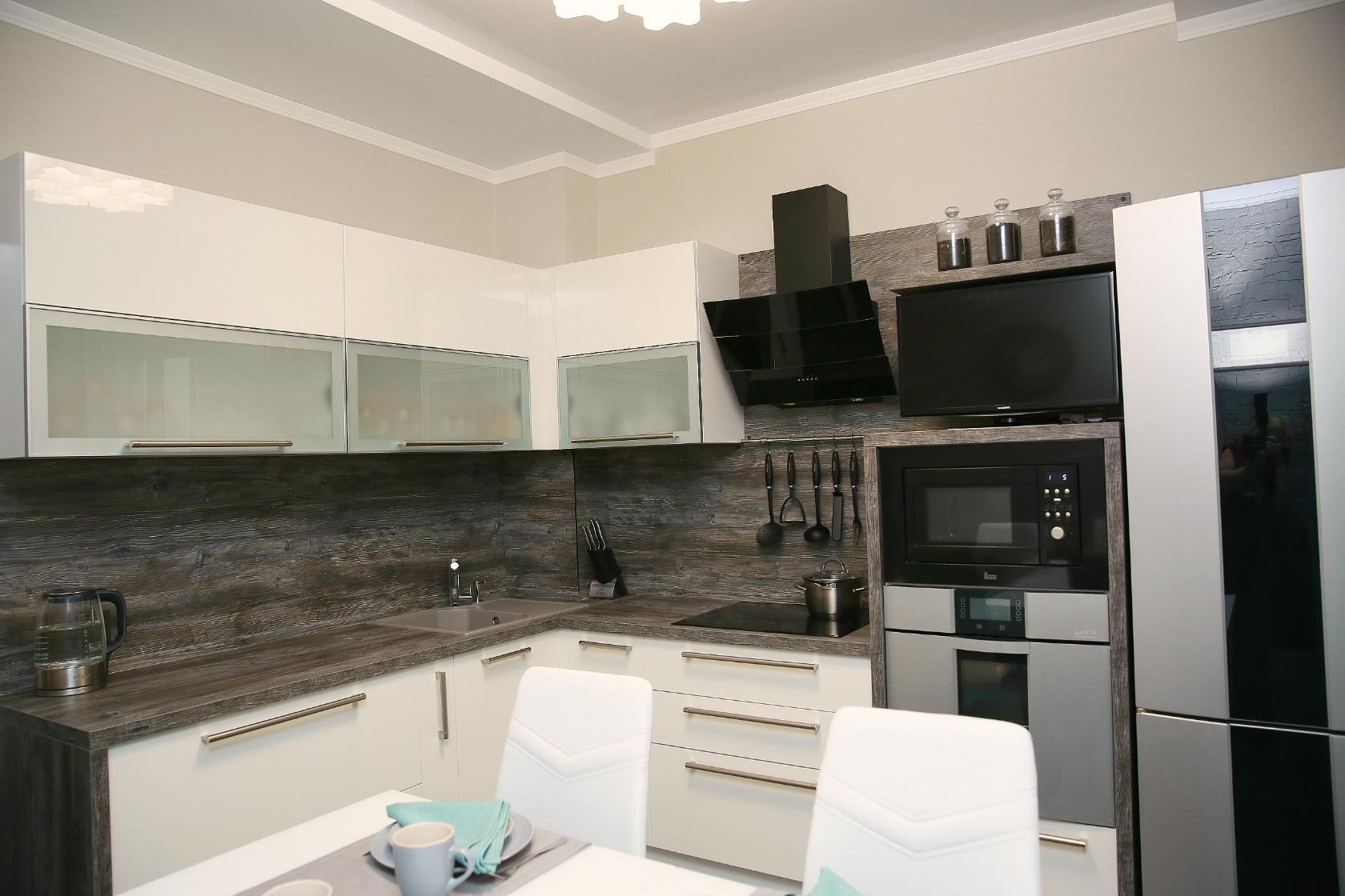
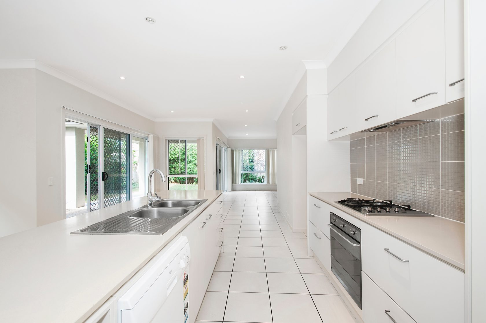
There are several rules on how to choose the right kitchen countertop by color. It is necessary to focus on the general style of the interior. For example, if this is a loft, then a light or dark wooden tabletop will look beautiful. For high-tech design, predominantly white is chosen.
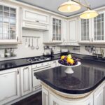
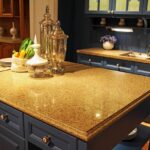
For historical styles (classic, rococo, baroque), choose light shades interspersed with gold or made from marble. Therefore, the first step is to build on your own preferences and compare them with the chosen design.
Additional Information! There are no specific principles for choosing the color of the countertop. There are only general rules and principles of combination that will look best.
General principles of color selection
If you follow the general principles of how to choose the color of the countertop and apron in the kitchen, you can achieve the perfect combination that will attract many glances to itself every time and collect a large number of compliments from guests.
When choosing a color, consider the following points.
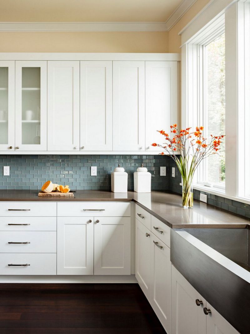
- The color of the countertop should be repeated in at least one other piece of furniture.
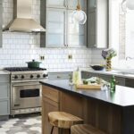
Of course, it would be ideal if it is not limited to one element.This is not a hard and fast rule, just a safe way to color your countertop. This way you can achieve an excellent result. In one color, you can make a countertop with a kitchen unit facade, an apron, a window sill, a dining table top, a floor. These landmarks are traditional. They can most often be found in ready-made interiors that shops offer.
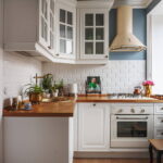
But you can also choose the color of the work surface in the same tone with any other piece of kitchen interior. These can be curtains or wallpaper designs. The main thing is that some elements overlap with each other. This method can be used in the reverse order. This is suitable for those who started arranging the kitchen not with the selection of furniture, but with the decoration of the walls. That is, the countertop is matched to the most common colors in the interior, and not the colors of the interior under the countertop. - The kitchen countertop can be in a contrasting color.
According to the principle of contrast, the most harmonious and pleasant color combinations are created. The only thing is that applying this advice is not always very easy. That is, let’s say, white and black are contrasting and are a win-win combination with each other. But what about other colors, and on what basis should you choose them for tandem? With this, everything is very simple. You don't need to have certain knowledge. You can use ready-made contrasting circles or tables. Color wheels are used according to the rule: the best contrast combinations are opposite each other. For example, if the table top is made in a yellow-green shade, then red-violet will be contrasting. The combinations are not the easiest and due to this they look very interesting. - You can choose according to the practicality of the color.
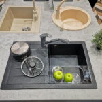
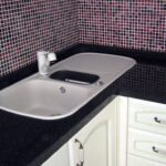
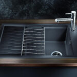
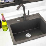
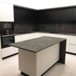
Everyone thinks that easily soiled countertops are white and any other light ones. But this is actually just a common myth. In fact, dark ones stain much faster than light ones. At the same time, it is easier to look after whites and in this matter they are unpretentious, which cannot be said about blacks. An example would be any scratch. It will be difficult to see it on a color shade, but on a dark one this defect is immediately noticeable to the naked eye. It is the same with dust, crumbs, drops of water or any other liquid. If you still want a dark-colored countertop, then for practicality it is chosen with light blotches or veins.
Stone, wood or drawing
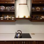
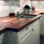
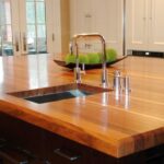
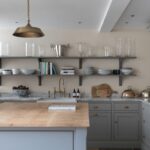
Stone, wooden or patterned - everyone chooses. Here again, practicality is taken into account. Solid wood or its imitation in many styles looks very advantageous and is often used by designers to compare all color schemes. Wood is a versatile solution, like white or black. The best combinations are obtained with pine, reddish tones, browns or mahogany.
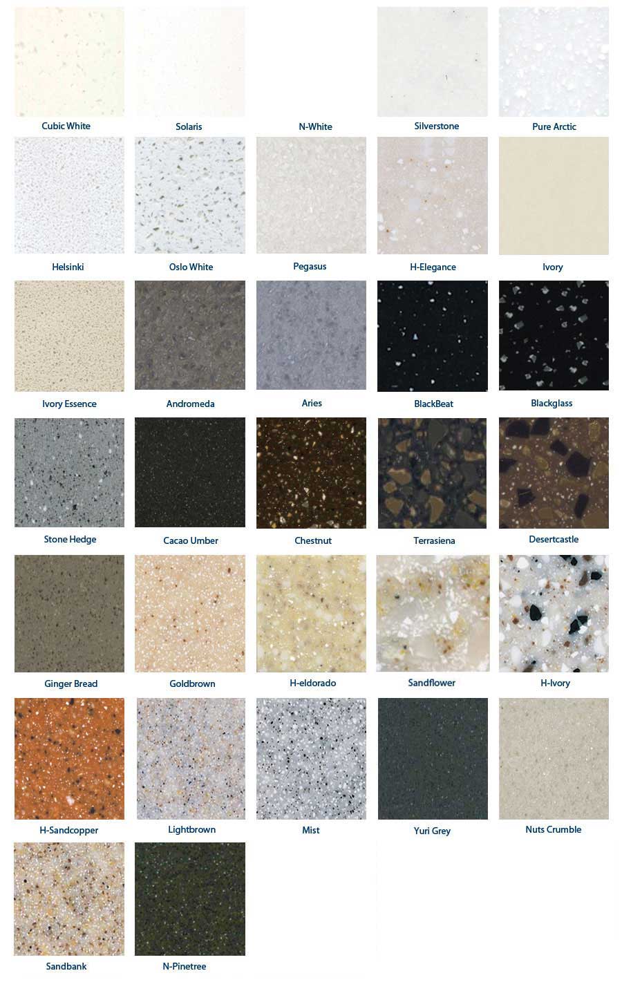
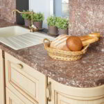
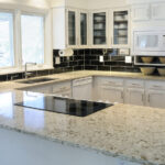
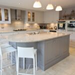
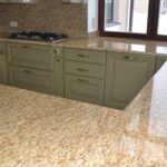
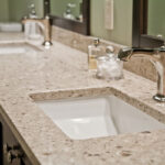
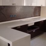
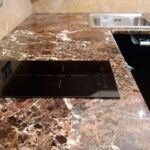
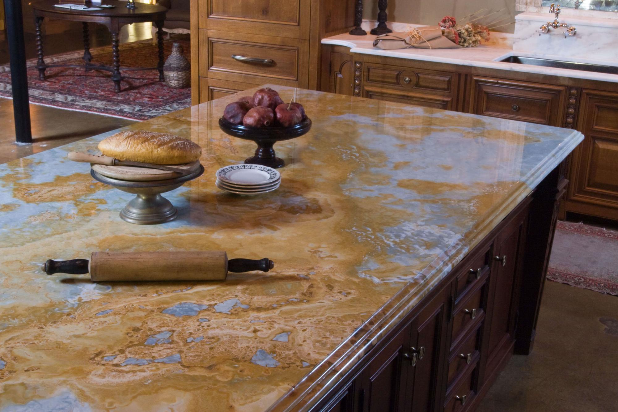
Stone is one of the most practical. It practically does not show defects in the form of scratches, and it is easy to clean. If imitation is selected, then it is better to give preference to light shades in combination with dark ones.
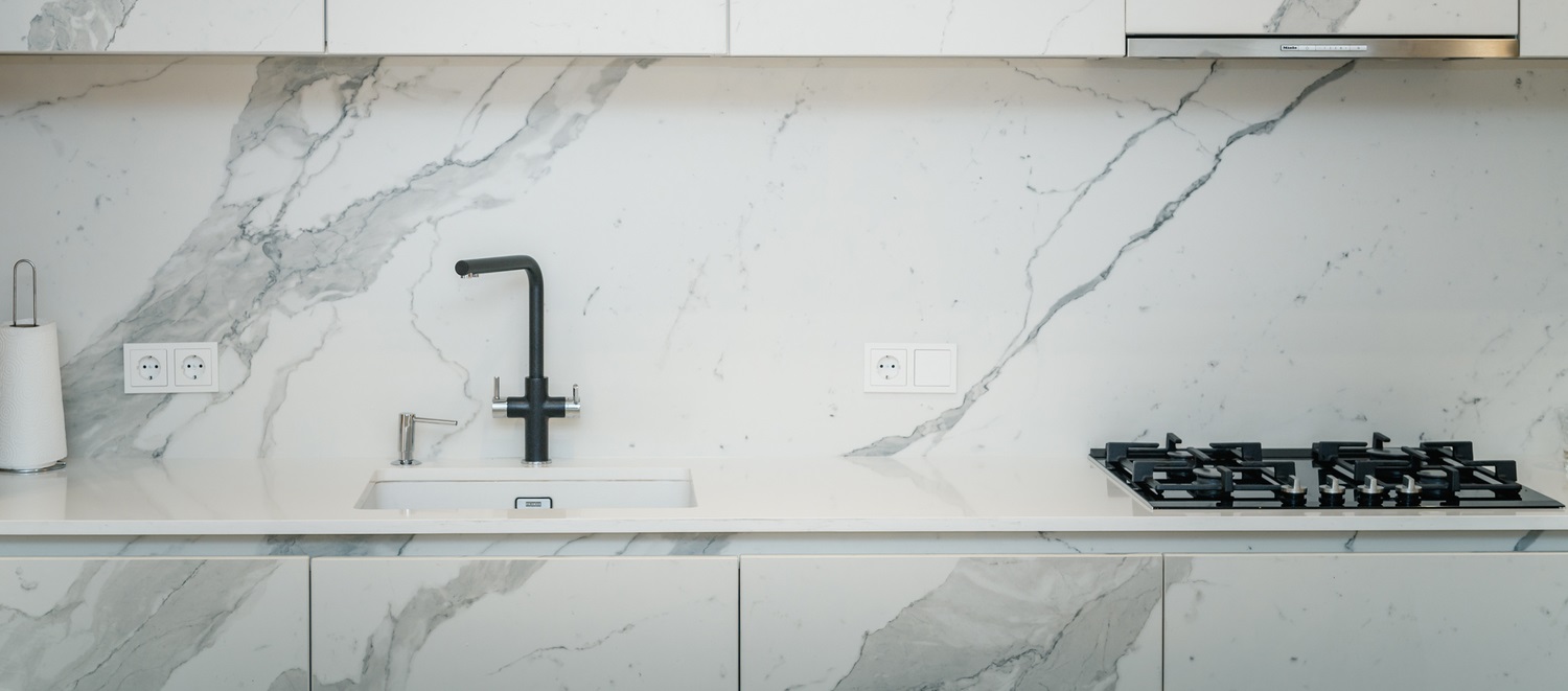
Additional Information! The marble surface looks beautiful only if thin veins of black or any other color are made on white. Thick ones will spoil the appearance, as they do not look well-groomed.
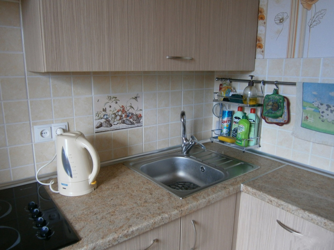
Drawings will help to hide the scratches that appear later. These options look very interesting. But combining them is the hardest part. It is better to choose minimalist paintings that will not overpower the main focus.
Tone selection
The tone is selected according to the principle of the greatest amount of color in the kitchen. That is, if there is more white, then this is a cold tone.And the table top is chosen with a cold undertone. The combination of warm and cold does not always look advantageous, since this is done only by professionals who know many subtleties.
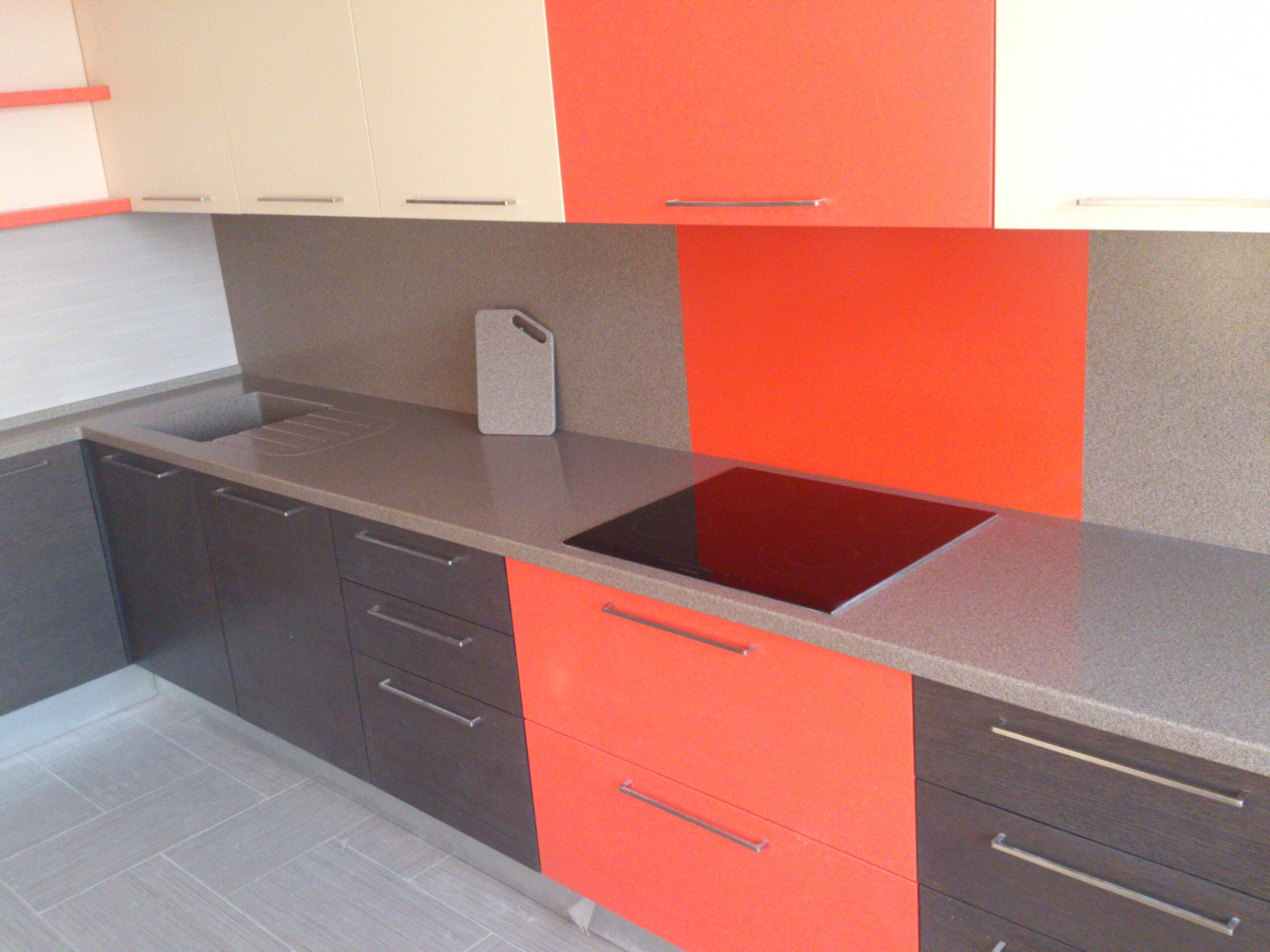
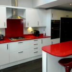
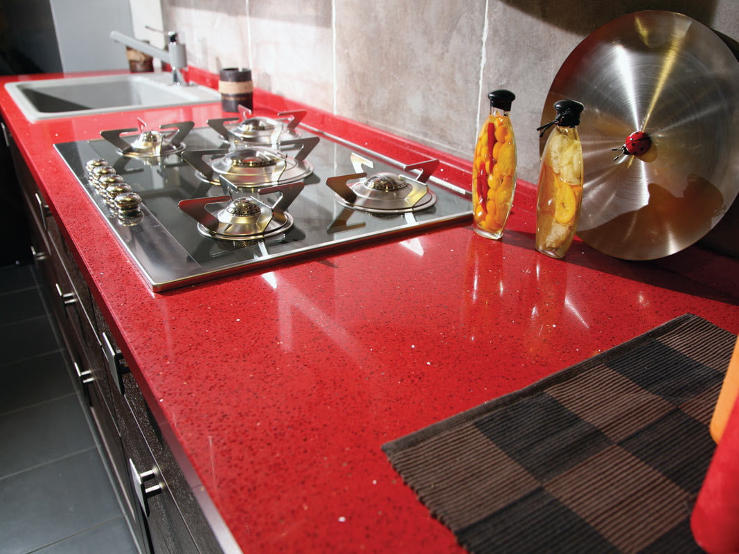
If the kitchen is made in red, then you should adhere to this and select suitable colors. They should not be flashy, a slight contrast is enough. You can choose the main color of the kitchen and simply divide it into several tones.
An example would be a kitchen with a main shade of pink. That is, each detail is made in the same color, but more saturated or pastel, diluted with white or blue.
Colored or plain
Color is much easier to combine with the interior, and it looks more interesting. Here you no longer have to specifically look for a repeating color in the interior. It is enough just to adhere to the general style. Plus, it will be much easier to choose colors for the dining table, apron or facade.
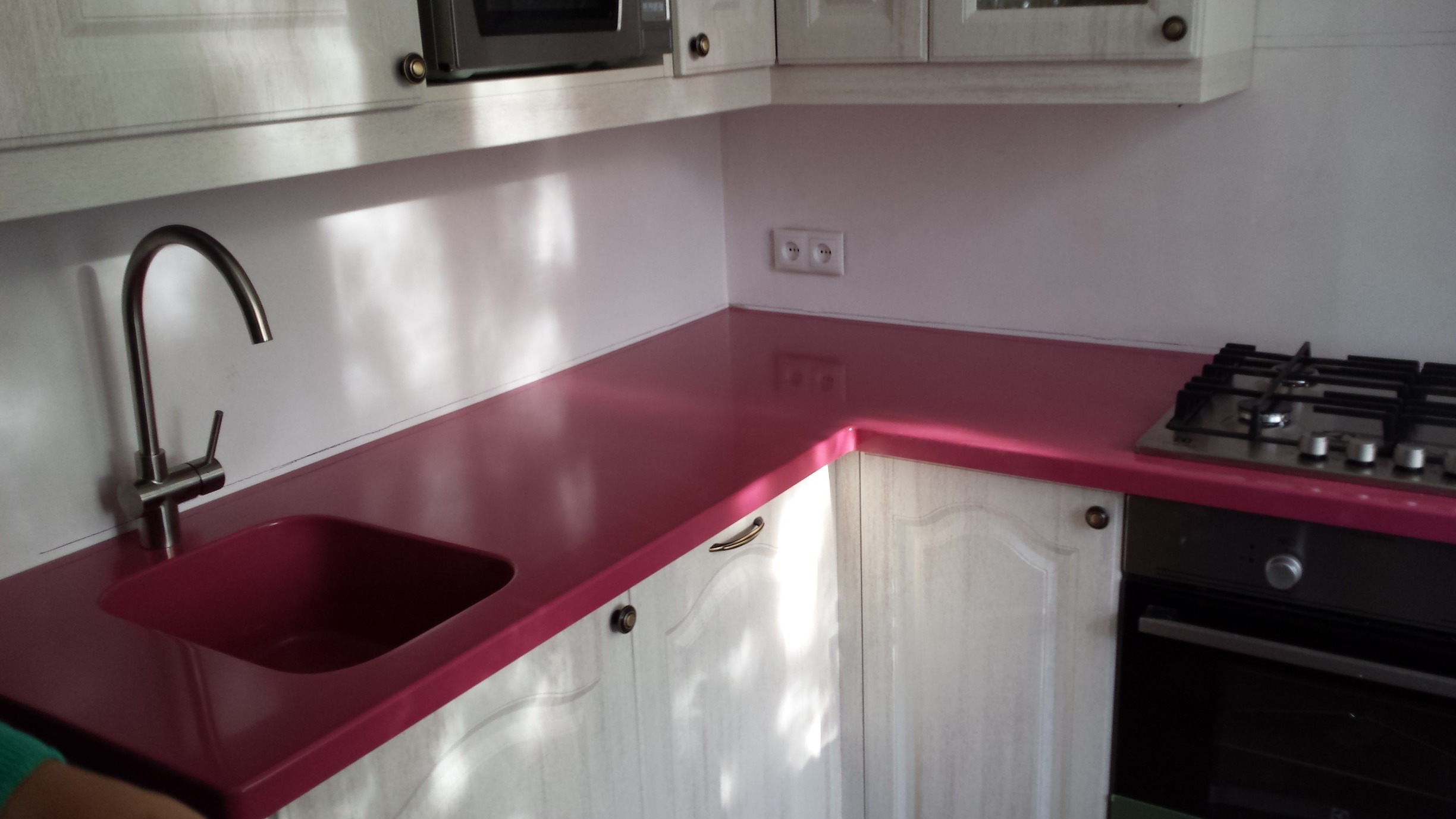
You can find a countertop that repeats at least one color from the interior. But if just such an option is chosen, then it is no longer recommended to select multi-colored interior items. Solid color is a classic that always looks great.
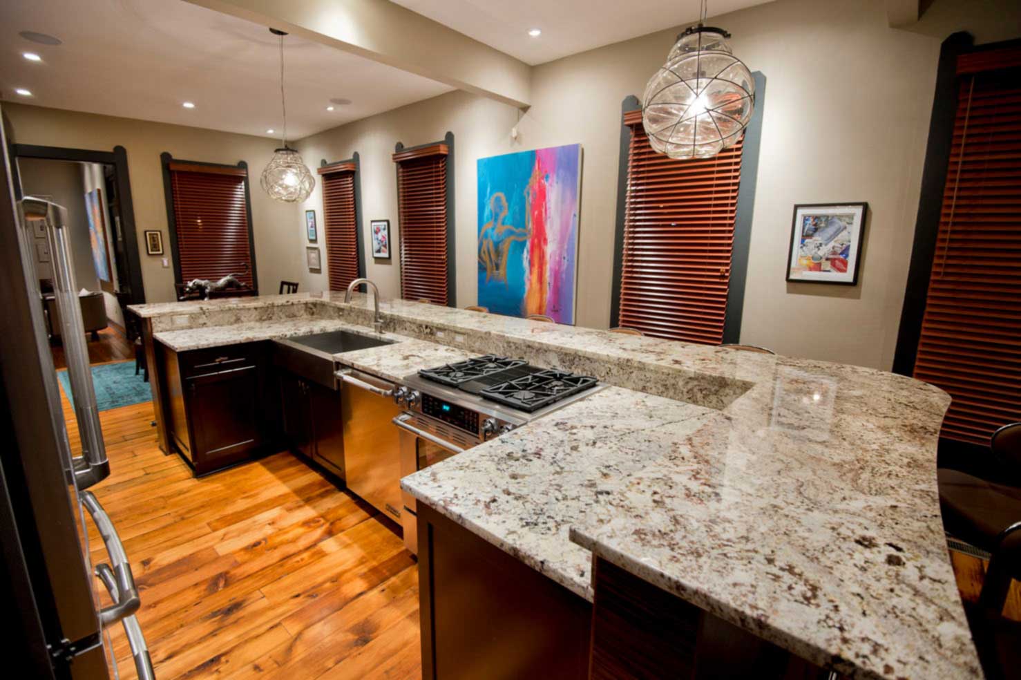
The advantage of such a surface is that it can be monochromatic with a pattern. Stylized stone or wood is acceptable.
Features of the original countertops
The peculiarity of the original countertops is that they are used not only in the area of the working kitchen surface in the lower tier of the kitchen set. They can be applied in a broader direction. Let's say continue on to the bar counter, separate islands or on the dining table.
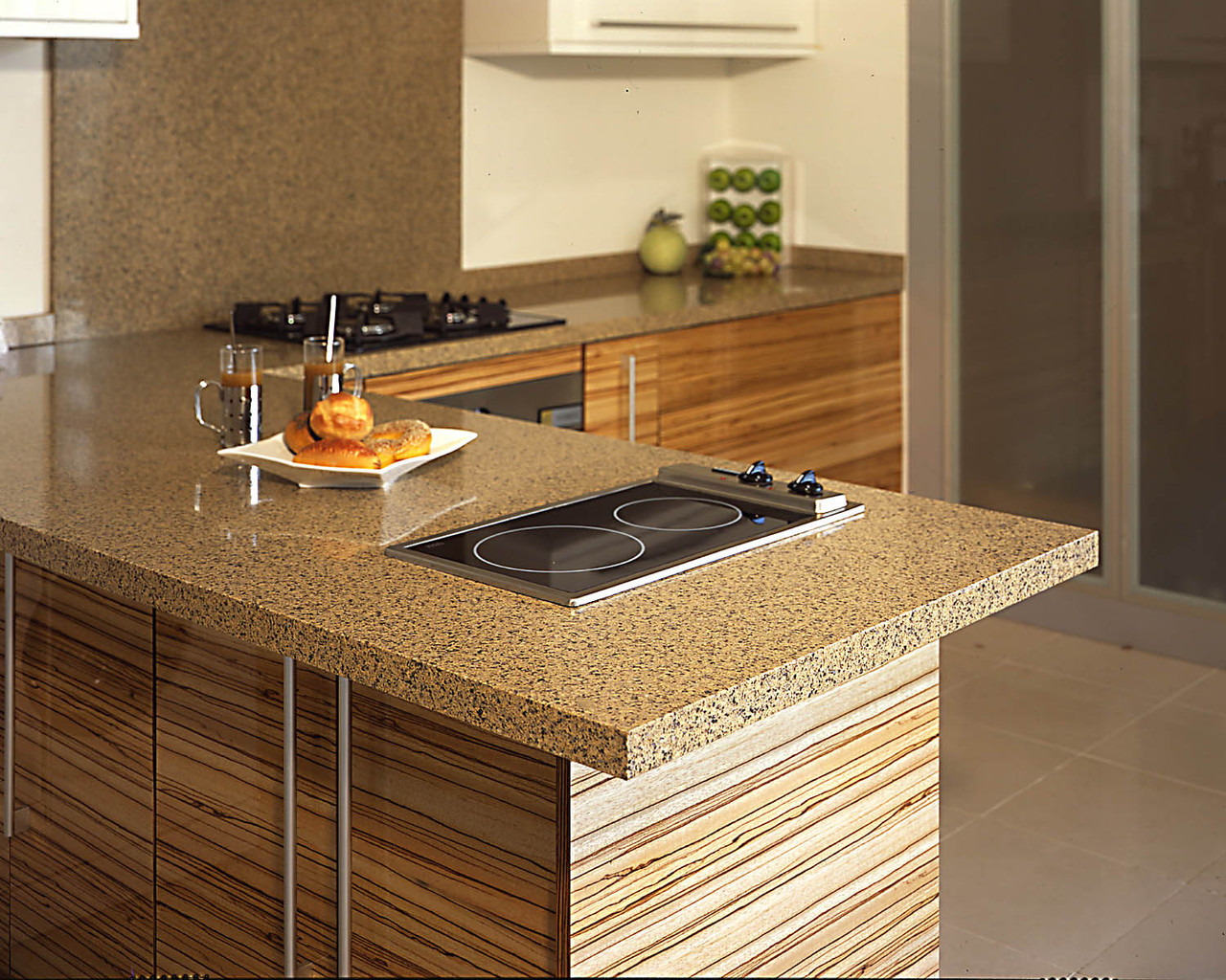
The coatings are made in bulk, steel or stone. Glass countertops look especially original. They add freshness to any space. They are often used for small kitchens, as the colors will overload and visually reduce the space. You can also find folding or pull-out models.
Combination of countertop and kitchen design
Continuing the theme of combining kitchen design and countertops, we can say that each style has its own design features. A Japanese countertop is unlikely to fit in a techno kitchen, and a colonial one in steampunk.

In order for the final picture of the interior to look harmonious, it is important to observe the combination of styles. In rare cases, mixes give good results. This only happens under the guidance of a professional. You don't need to experiment on your own. This will lead to a waste of money and a waste of your time.
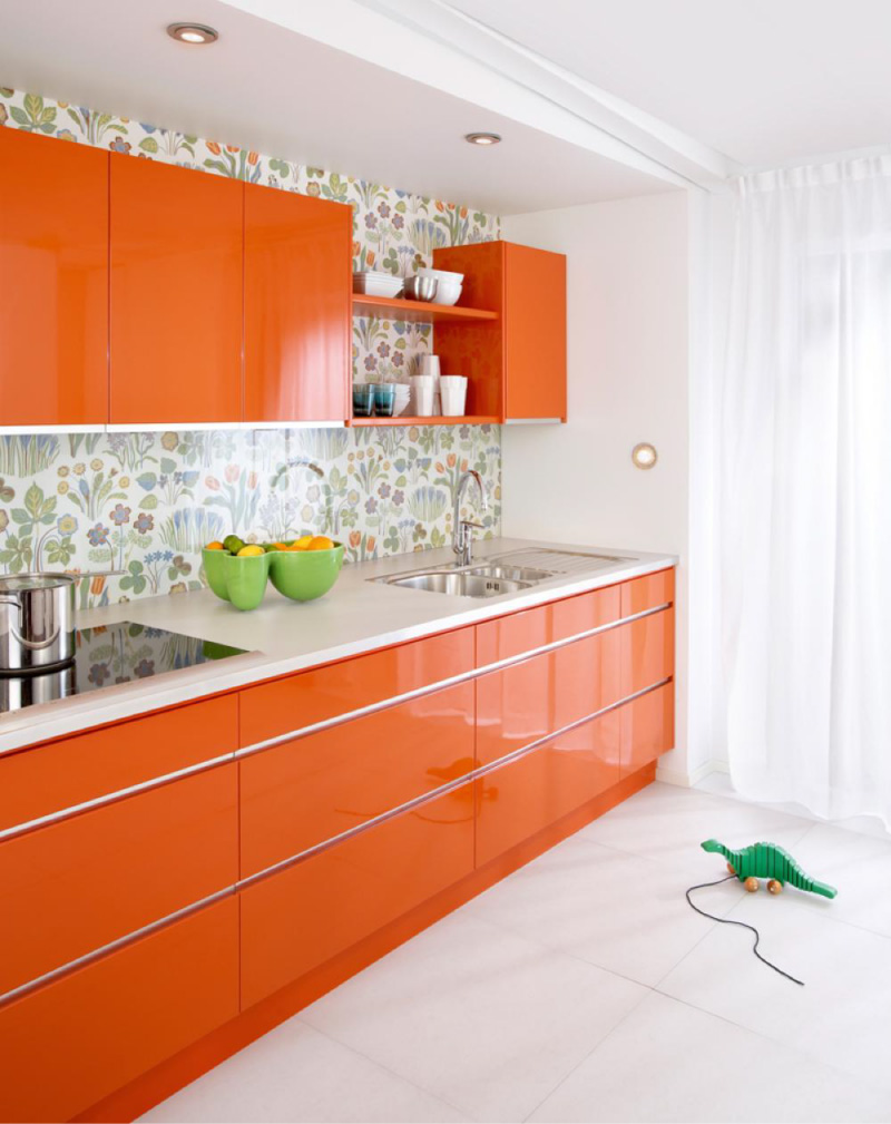
Examples of combinations:
- Shabby chic style is characterized by pastel light shades of countertops. They can be white, light green pink. Are welcomed with drawings of shepherdesses, flowers or birds of paradise.
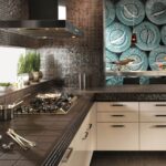
- For brutalism, dark shades and tones, angularity and restraint are suitable. With rare exceptions, red is used, which adds its own unique feature.
- For a grunge kitchen, they choose exclusively a wooden countertop. It gives warmth and coziness to a strict room.
Pros and cons of dark and light surfaces
Each shade has its own advantages and disadvantages, but the main characteristics can still be distinguished.
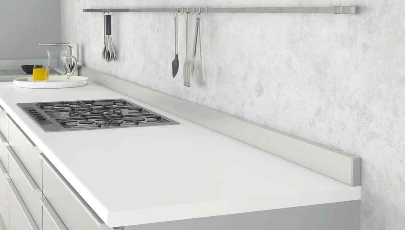
Pros and cons of light:
- Settled dust is not visible.
- Unpretentious care.
- Colored dirt is difficult to wash.
- Scratches, water droplets are less noticeable.
- Visually enlarges the space.
- Long lasting with proper care.

Pros and cons of dark:
- Settled dust is visible.
- Quite whimsical in leaving (you will have to wipe it often).
- Colored dirt is more easily washed off.
- Water droplets and scratches are visible.
- It can visually reduce the space and make it heavier.
- Long lasting with proper care.
How to care for a kitchen set
Each material has its own rules of care. But a number of general requirements for the care of a kitchen set can be distinguished.
- Rule # 1. Good care begins with proper installation. It is not recommended to place radiators nearby.
- Rule # 2. Direct sunlight causes the color of the furniture to fade quickly. This is especially true for wood.
- Rule # 3. For cleaning, use only mild products without abrasive particles. Rags are best made from flannel, cloth or microfiber.
- Rule # 4. The use of hard, iron brushes is not recommended, especially for glossy surfaces.
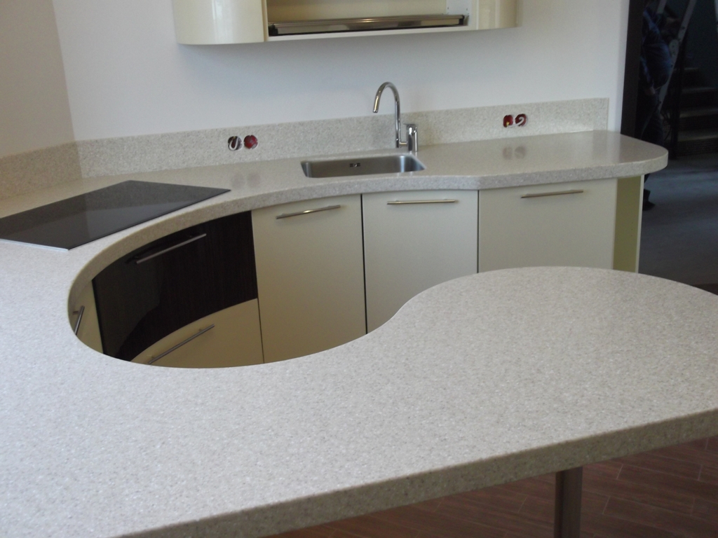
After a detailed description of the general rules on how to choose the color of the countertop and apron in the kitchen, anyone can cope with this task. This does not require special training or knowledge. It is enough just to take into account some recommendations.
Video: kitchen countertop
